Esthesia: (noun)
1. The capacity for sensation or feeling.
2. Sensitivity.
3. The ability to perceive a stimulus.
Here’s a memory of swimming, being little, a navy suit with with one wide white stripe and gold buttons. The motion of scooting on a concrete ledge towards the water results in snags as the fibers of the suit resist. The feel of concrete rough enough to wince. The feel of fabric, nubby, left like unusable velcro; mangled shreds and strings. Texture dismantling texture.
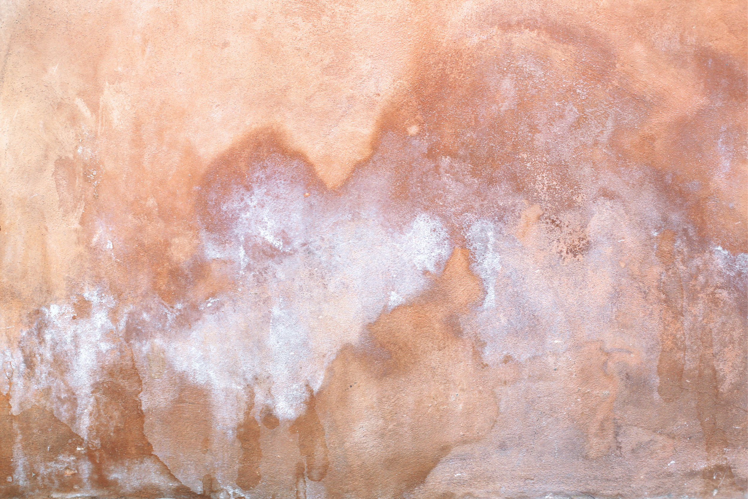
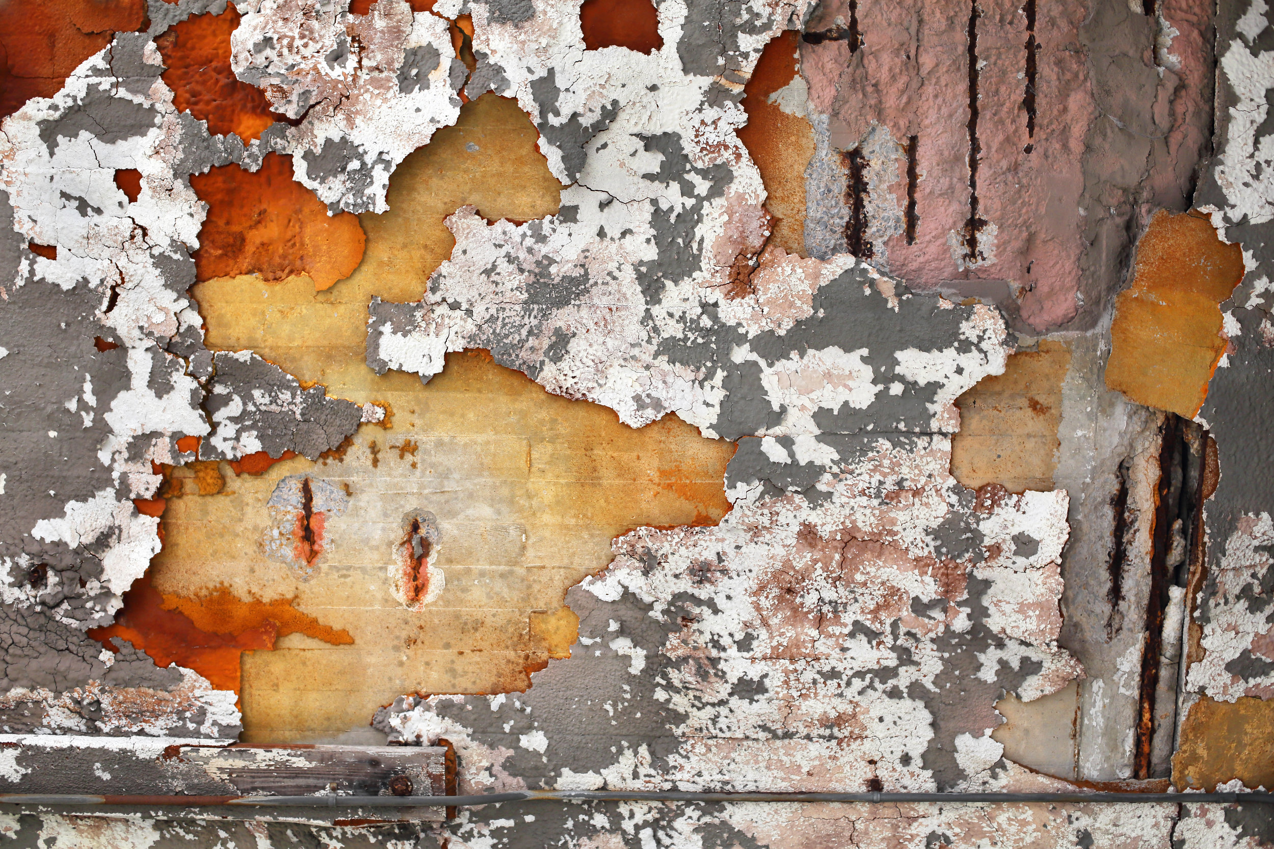
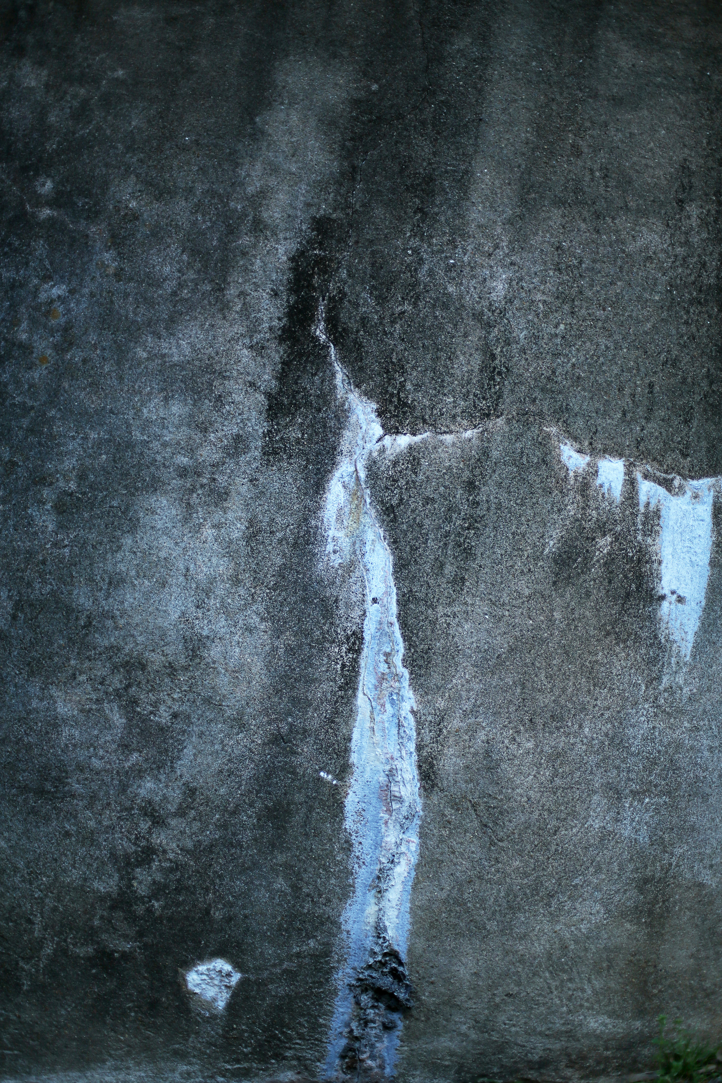
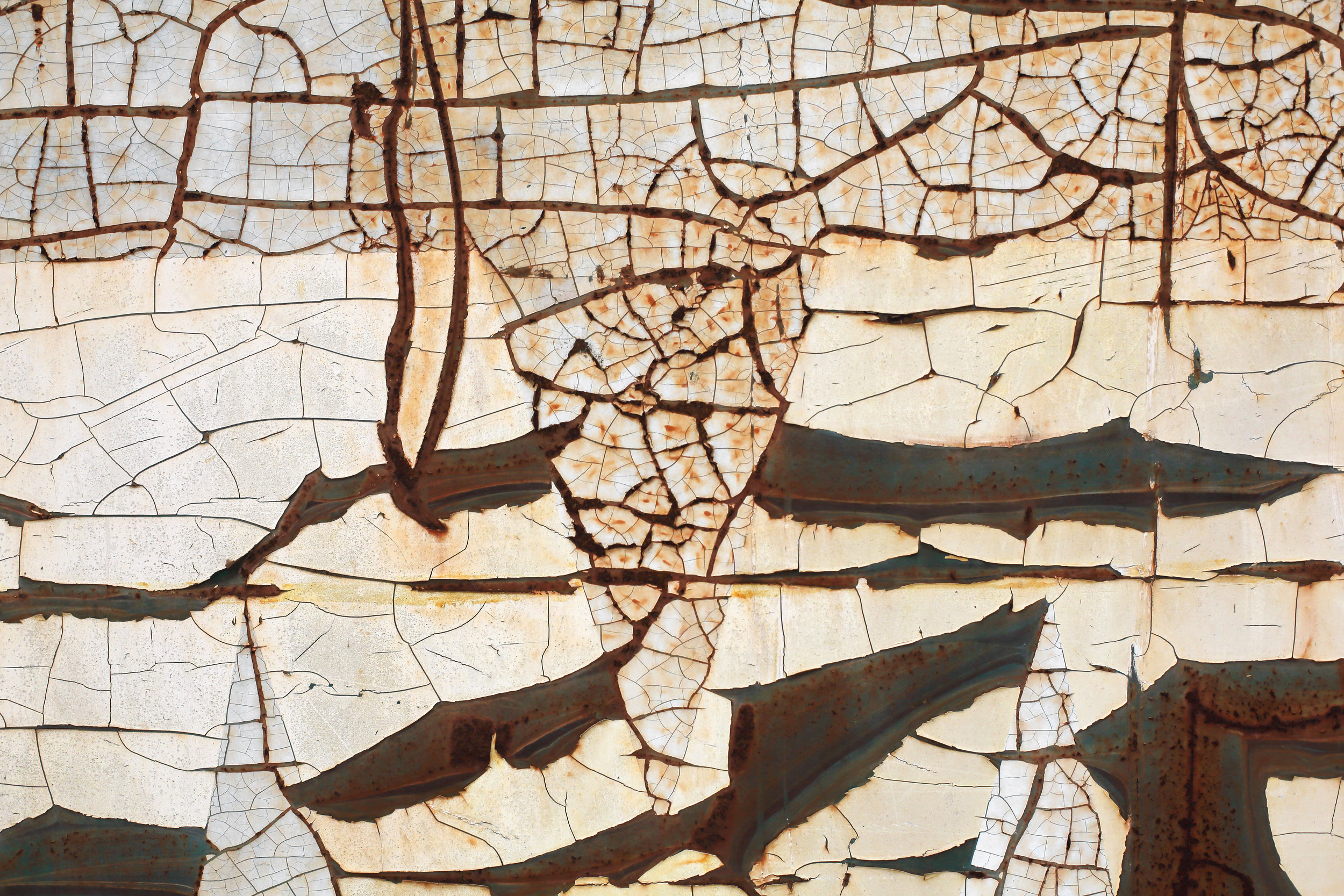
Esthesia explores the conflicting emotions and memories I experience when I encounter texture in my environment.
I experience texture with touch from my skin; with crunch between my teeth; complexly with my ears and eyes. It is influenced by light, temperature, scale, taste, and memory. I can even experience texture from within my own body when it is chapped, scabbed, or burnt. I think of texture physically in two ways: ones I like, and ones I don’t.
Picture: naked, un-glazed ceramics. The skin of a peach on your tongue. Sandpaper, stucco, packing peanuts, burlap. When you drop a piece of flat, slick paper to a raw concrete floor and cannot pick it up, just like you have to lick your fingers to turn the page of a book because the paper, in its slickness, is resisting the expansive grain of your own skin.
Think of soft, rubbery foods to chew between your teeth like over-cooked mushrooms and eggplant. When I think of or see these things my reaction is to shrivel and grimace, like I have just heard a high pitched squeal. Discomfort and recognition.
Picture: the velvet grit of sand sinking beneath the mass of your body. Fur. The crust on a loaf of bread, ranging from flaky ridges to powdery traces of flour. The raised veins in a leaf. Any kind of repetitive grid: a screen, a pegboard, the grooved ridges of a pumpkin. The soft wrinkles of warm plush lips against lips. Smooth, the absence of texture. A slick flat plane. Like a polished rock or worry stone. Like satin. Thinking of touching or seeing these things makes me feel relaxed enough to close my eyes. Comfort and recognition.
The tactile act of feeling is sensual. I am fascinated that even seeing texture evokes an emotional response, as if I were experiencing the texture physically. The sense of recognition is so strong.
To back up, I want to preface “Esthesia” with a little more about the body of my artistic work. “Estheisa” is a new artistic direction for me.
My interest within the medium of photography generally lies with people. I love the body’s expressive language within thematic scenes: humor, whimsy, and narrative--all made possible by the beauty of the figure within its environment. This was the most relatable art for me to make because I connected with characters who have the visual dimension to think and act within a scene that I put them in.
To me this encompasses theory of mind, which means to attribute mental states to oneself and others and to understand that others have beliefs, desires, intentions, and perspectives that are different from one's own. As simple as it is, theory of mind continues to fascinate me in art. I specifically enjoyed breaking the third wall by having the figure look directly and knowingly at the viewer. It becomes a hall of mirrors: the viewer thinks about the character thinking about the viewer.
There is an inevitability in gravitating and connecting to a human representation. We anthropomorphize most of what we see by second nature. It fascinates me how we create and show narratives to young children like “Brave Little Toaster” in which an appliance emotes and goes on adventures. We look at clouds and find faces. We seek out aspects of humanness everywhere.
When I thought about “Esthesia” as a contrast to my previous work, I realized a human physicality is present within an image of a textural object through the implied sense of touch; and also a sense of denial: you can’t actually touch, because it is a two dimensional photograph. To me this is a driving factor in the emotion. I’m experiencing the tactile humanness of texture visually and associating it emotionally with a physical participation that I have had, could have, or might have, which is another sort of “hall of mirrors.”
Esthesia, which prompts you to consider your capacity for sensation and feeling, is akin to synesthesia. Synesthesia is when one sense of your body is produced by the stimulation of another sense. I once dated someone with synesthesia who would see color based off of the way he was feeling or the way something sounded. Sometimes he would tell me my voice made him feel and see purple and gold. Similarly, it is common for people to touch a smooth texture, like a worry stone, and feel comforted, or to rub up accidentally against a rough surface, like stucco, and cringe or feel on edge.
For me, I cannot bite into a whole peach because the fuzzy texture of the skin on my tongue is so intense and undesirable that I cannot continue, even though I love the taste. At the other end of the spectrum, for example, I was having drinks with some friends when a dried bean pod fell from the tree above our table. Once I picked it up I couldn’t let it go. I had to feel over and over again the slick dips of the empty sockets on the inside where the beans had once been. It became mesmerizing, but also comforting.
The culmination for me of both feeling and seeing texture as sources of emotion came about for a job.
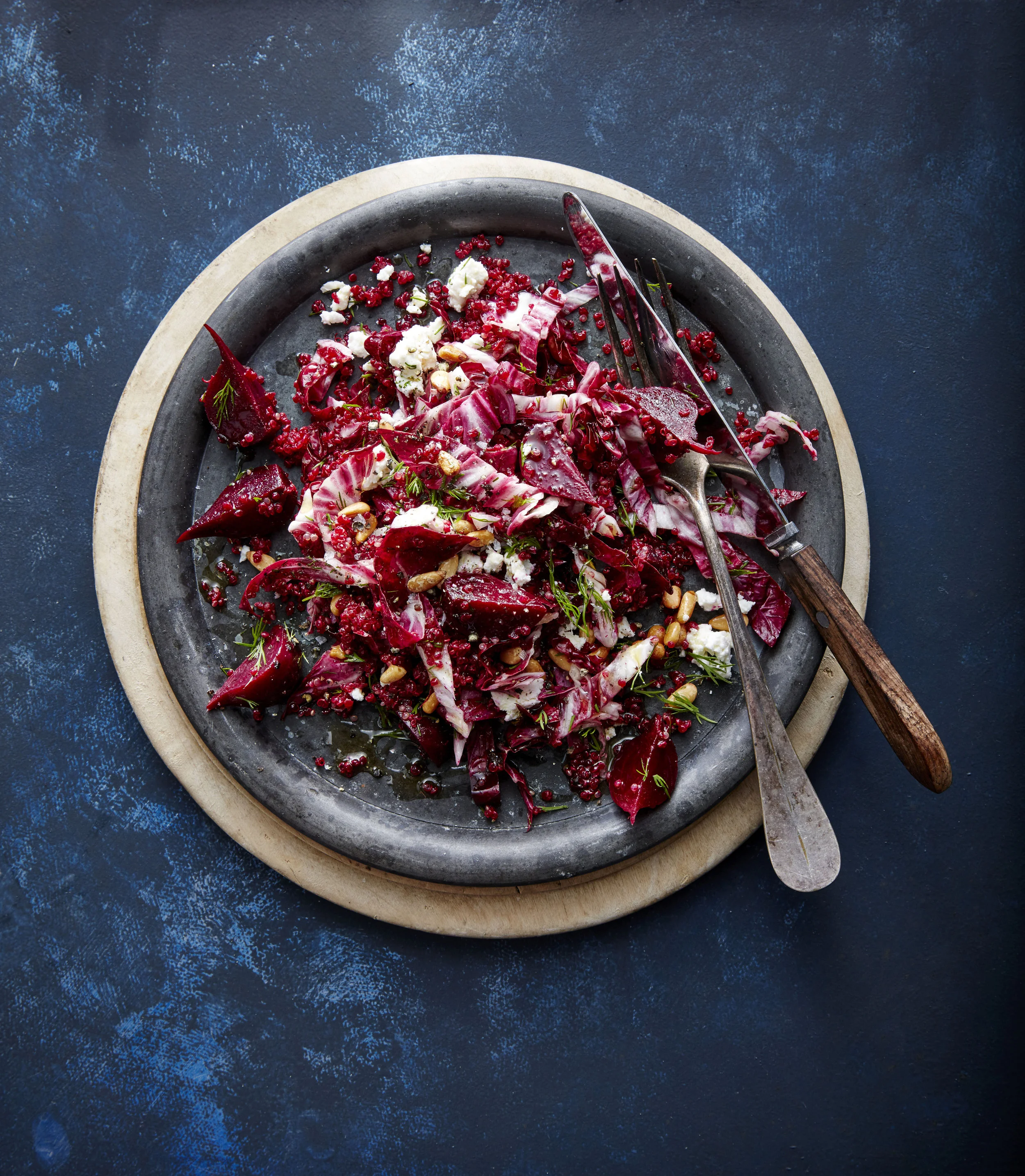
Cooking Light Magazine, June Issue 2017; Photography: Jen Causey; Food Styling: Chelsea Zimmer; Prop Styling: Heather Chadduck; Surfaces: Audrey Davis
Cooking Light Magazine, June Issue 2017; Photography: Jen Causey; Food Styling: Chelsea Zimmer; Prop Styling: Heather Chadduck; Surfaces: Audrey Davis
I accepted a position at a photography studio prop styling and coordinating for Time Inc. brand food publications. A large part of the job is sourcing surfaces, or mock tables, for photography sets. We photograph so many recipes that the demand for variety and distinction between brands becomes high.
Consistently, creative directors ask for surfaces with texture--it adds interest, of course, but it also supplies a “lived in” feel of the well worn, well loved, and of comfort. Part of this was satisfied in hunting for antique tables that have a sense of history; but requests became so specific that I learned to echo this in painted creations. I experimented with smearing, distressing, and building up layers of paint. And, I also began to search for worn metal, wood, stone, and plaster, both to paint on top of, and also to reveal in their natural states.
The more I looked at texture in the context of warm, engaging table-scapes for publications, the more I valued the “found” and unintentional textures I encountered. Many artists photograph a subject as a reference they wish to explore in another medium like paint. There is an interesting cycle here then that speaks to the modern era that I am working within. I find textures out in my environment that become a visual bank of inspiration from which to paint. These paintings are then used as surfaces that are again photographed. So, is the choice of the medium relevant to Esthesia, and why? How does this choice separate my work with Time Inc. versus my work with Esthesia?
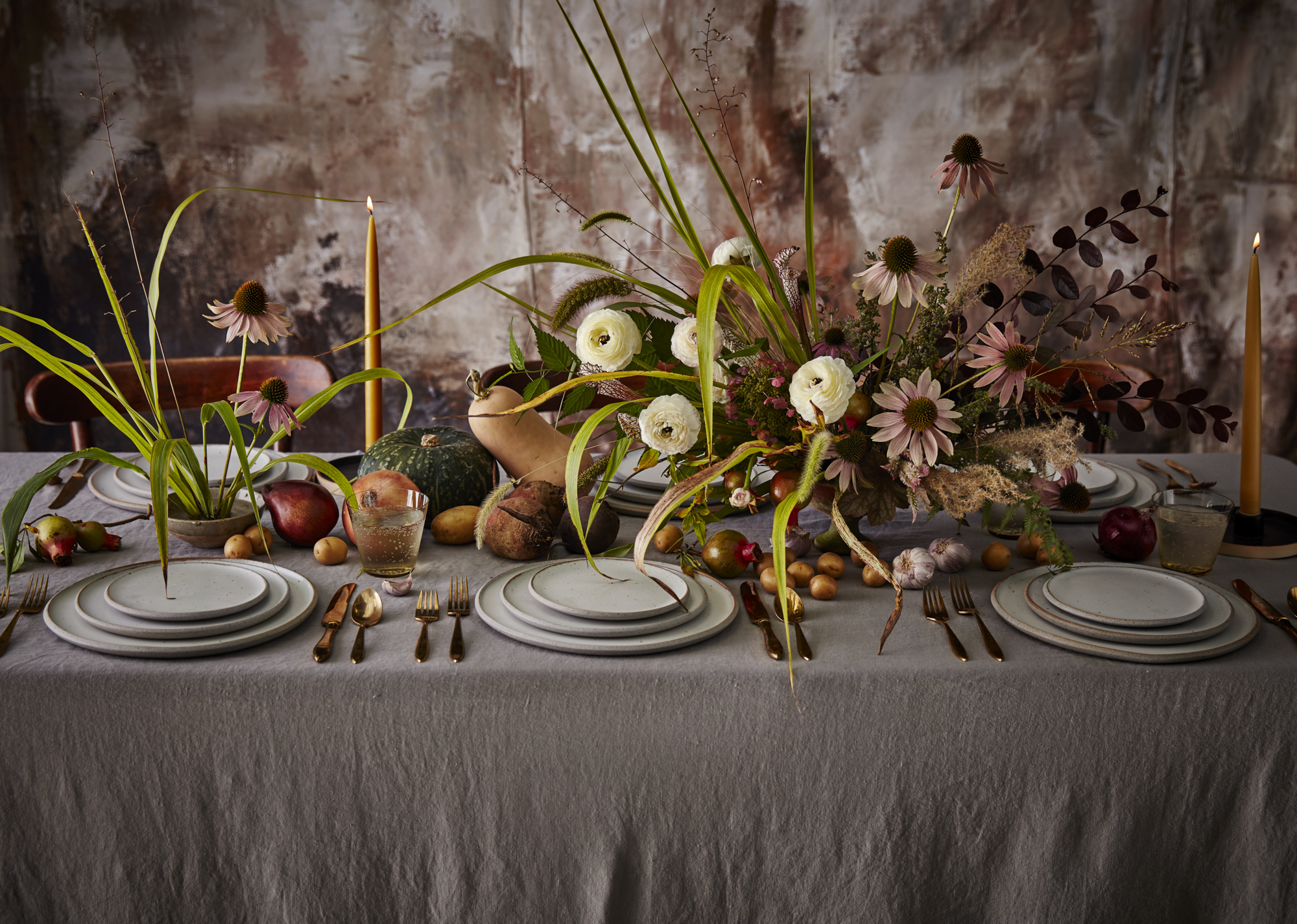
Cooking Light Magazine: November Issue 2017: Photography: Jen Causey; Food Styling: Chelsea Zimmer; Prop Styling: Heather Chadduck; Backdrop: Audrey Davis
The answer is, I did explore the initial groundwork of just experimenting with paint. I painted so much for my job at Time Inc. that I requested one full-time day every two weeks to paint. And I was fortunate to be given mostly free reign of what I could paint. Obviously, these pieces would be used as surfaces for publications, so I did have to go by some guidelines, mainly regarding the color palettes that were requested for specific feature stories. And sometimes I was given a direct picture to imitate.
The rest of the time I would simply play around with different ways to reproduce interesting textures that could be versatile enough to photograph in different ways each time they were used. I love this portion of my job and spent these hours and days contemplating the beauty of texture that I can manipulate out of paint. Splattered in paint, clothes and shoes and skin always speckled in color, I imagined the application of paint as a final product of artwork and the concept behind the driving idea of texture and its appeal.
I think the main split from painting to photographing actually stemmed from jealousy. Producing work for a company is a transaction. It left my hands to serve a purpose other prop stylists and photographers could interpret and adapt. I didn’t have ownership, obviously. However, it was fascinating to see the ways photographers could use light and color balance and cloning tools to re-envision a surface I made into a fictitious digital piece.
This very versatility--that a strong surface can be re-imagined simply by altering light--is what made my skill of painting valuable to the company. But that’s also the magic of photography--it is at once real (a realistic copy of a subject “truer” than perhaps a drawing or painting), and yet also unreal (an adjusted or manipulated representation of a real life subject). I could have separately painted pieces for Esthesia outside of company hours that I could own and have rights to, but photography made me consider texture in a different way. Essentially, the control and manipulation in presenting these textures photographically gave me a stronger sense of ownership.
My next step in embarking on this project was to consider what makes up texture.
To experience texture by touch requires raised three dimensional planes. As a two dimensional visual, these different planes interact with light. A dip becomes a shadow, a bump a highlight. Presenting texture photographically allows me to show a texture in a single moment of time influenced by light. Texture comes into existence as a process, and I wanted to encapsulate just once stage of that long process.
Consequently, process suggests a narrative, which reminds me again of the human connection. We think of new as smooth, wrinkled as old, a process our own bodies transition through. Objects start out as one texture, and time and exposure, creates another. I think of the cycle of wood: a slim, sleek sprout that grows to a mature tree, the inside still smooth but sheathed by rough bark. A tree cut to planks to be built into a surface exposed to the elements. A board, dried and splintered. The polished touch of petrified wood, ancient and contradictory.
I also found that I was drawn to representing only some types of textures. Partly, this can be explained through my background in prop styling to find surfaces with depth that provide a sense of history, like a loved table passed through generations. I concentrate on non-organic textures like metal, plaster, stone, paint, and cut wood. To me these man-made pieces, or textures altered from their natural state for human use, encompass an intentional realm of sensation visually and physically felt.
These materials warp and tear and change with the presence of time, especially after they are worn down by human use and exposure to the elements. The lack of upkeep renders the original intention of the material altered.
The narrative here is abandoned structures. Again, a human presence is felt in the knowledge that they were there within this structure and have left.
There is a sense of the Southern Gothic in old or abandoned textured environments. Yet there is also a mixture of the Urban Gothic in Esthesia, in which post-industrial urban society is manifested in dark city-scapes. Both reinforce the narrative of time and the process of aging. Here the vivacity of color, often being swallowed up by rust and dirt, or even a fading or lack of color, also becomes a key factor.
To me, rust ranging from reddish brown to orange is particularly important. Throughout the process of working on Esthesia, rust colors began to symbolize the process of texture for me. I found myself particularly attracted to rust paired with blue. The remainder of the photographs tend to lean towards a neutral palette. Once I took a step back after the project was nearly complete, I was able to analyze these color pairings further.
Blue is a particularly popular color for food publications. Because my work prop styling for food introduced me to seeking out texture to begin with, I found this unintentional love of blue a notable subconscious preference.
Ranges of blue tend to contrast beautifully with food in a way that colors like purple or yellow cannot. It can be magical, considering you really don’t see blue within most food itself. Monochromatic food like fried things and casseroles that don’t hold a lot of visual interest on their own are enhanced by blue. And more raw and natural foods, for instance vegetables and fruits, really pop against a blue surface or vessel. Blue can also be used year round: pale blues and aquas feel more summer and spring, while navies or teals are more fall and winter tones.
Essentially, blue is a very versatile go-to for food photography, especially for foods that are difficult to make beautiful or appealing on their own.
On the other hand, you also see a lot of neutral tones within propping so that food is the main factor that stands out in an image. For instance, one of Time Inc’s brands, Cooking Light Magazine, just went through a big re-design. Now, all of their content besides features all have black, white, or grey propping. They conducted focus groups during the re-design and the feedback they received was that the audience wanted the images to be “all about the food.” These neutral tones helped provide that “food-forward” aesthetics so that all other elements, like the props, fall into the background.
In essence, my mind reverted to some unspoken rules or tricks within the world of prop styling. Because these are the palettes I use every day at work, these tones have seeped into my mind while photographing Esthesia. This subconscious marriage of orange to blues and neutrals is a natural progression bridging ideas from the art I make as a prop stylist and the art I make as a fine artist.
To return to my process of decision making, one reason I chose not to illustrate organic textures, such as the wrinkled skin of a gourd, was a decision mainly about scale. I abstained from macrophotography because I wanted these images to be more of an environment that the viewers can picture themselves interacting within. The sensation of texture hinges on our ability to recognize it, so I wanted the textures to be made of more obvious materials to correlate with a memory or an imagined experience inside of a space one can realistically reside inside of.
I also found I gravitated towards photographing materials that could make up a structure or shelter. This requires hard or more permanent supplies that have a longer lifespan than organic material, which would decompose quickly. Again, I wanted to reinforce the slow transition of what is man-made to a structure left abandoned and devoid of its intended function. Shelter is obviously built to protect, and when it is left to decay there is a sense of sadness, mystery, loneliness, and also intrigue.
Tying back to the theme of Southern Gothic, William Faulkner writes in As I Lay Dying: “The cotton house is of rough logs, from between which the chinking has long fallen. Square, with a broken roof set at a single pitch, it leans in empty and shimmering dilapidation in the sunlight, a single broad window in two opposite walls giving onto the approaches of the path.” There is a haunting sense of a dreamy but desolate past that is tangible. I think especially as a southern artist this connection to the past is relevant to my decision making.
Another aspect that I found appealing about the medium of photography over painting is that there is an awakening of the senses. You have to go out to find these textures--it becomes a scavenger hunt. I see textures in places that I would not other have otherwise noticed or investigated. The fact that they were mostly produced within Birmingham’s city limits reflects both convenience for the project, as well as that these textures reflect several aspects of the South.
Many of my images are fairly anonymous urban city-scapes, which ties to the Urban Gothic ambiance within my work. For a city like Birmingham that is slowly undergoing revitalization, I recognize that we have a mixture of appreciation for the old and the new that speaks to me. We remodel public spaces with historical significance and charm, like the Lyric Theater, which maintains a textural narrative.
On the other hand, we also demolish and rebuild the old when structural damage isn’t a factor. For instance, the Birmingham Terminal Station was torn down to downsize a big beautiful, but empty, station that was declining due to the rise of automobile ownership. Though the concentration was on the updated function rather than a faulty or at risk structure, the fact is we lost a piece of beautiful historic architecture when we could have come up with another solution.
I am not specifically arguing for or against historic preservation with my work, but rather romantically wondering how old structures that never had the opportunity would have aged. What story would they have told through the details of their textures? What does the removal of these old textures say about our urban history? How would my scavenger hunt of collecting exotic textures have changed? On the other hand, we do demolish and rebuild functional structures for more modern or an “improved” aesthetic all the time, which speaks to larger issues like gentrified neighborhoods. This brings up another point: we tend to see texture, when it indicates age and wear, as something dirty or dated.
The example that I think of is this: picture a heavily plastered wall, or a wall that has built up layers of paint. This is something that generally illustrates repair and maintenance. Thick application here maybe shows repeated upkeep, signaling age. Someone who has a wall like this is maybe doing their best to keep an older structure functional and clean.
On the other hand, this is a rustic “look” that we also repeat for pleasure to give charm. Think of all the people you know who tried their hand at a faux “Tuscan” wall in their brand new home. Essentially, people appropriate a “look” that excludes the baggage of it’s origin, such as a lower income house with plastered and continually repainted walls. Charm without history. Faux charm re-created in a day rather than years.
Given these thoughts regarding the perception of texture, I recognize that it is a multidimensional experience that we don’t often truly contemplate. Esthesia has been my way of investigating texture as a visual concept. Photographing something smooth or with an absence of texture would be less visually interesting, and it would also tell less of a story or provide less of an emotional attachment.
I tend to I focus on highly exaggerated textured environments with a sense of narrative, many of which would be unpleasant to touch, but that are pleasurable to see. There is a competition of the senses. It is a visceral experience to look at something unpleasant, like crackled shards of metal that would snag and tear your skin; then, emotionally experience that physical sensation, and still manage to find that image appealing. Ernst Fischer writes, “In a decaying society, art, if it is truthful, must also reflect decay. And unless it wants to break faith with its social function, art must show the world as changeable.”
To wrap up, Esthesia represents the urge to look and then react or feel without truly experiencing or understanding what is being shown. The conflict is being denied the real physical experience, but being shown that you have the capacity to feel regardless. Good, bad, beautiful, and interesting, texture is a constant part of our environment that we relate to and understand implicitly in a sensual way.
See the gallery for the full series:


